
REED BUSSINES
INFORMATION
VALUATION | INSIGHT WEB APP 2016
DEFINING KEY
ADVANTAGES
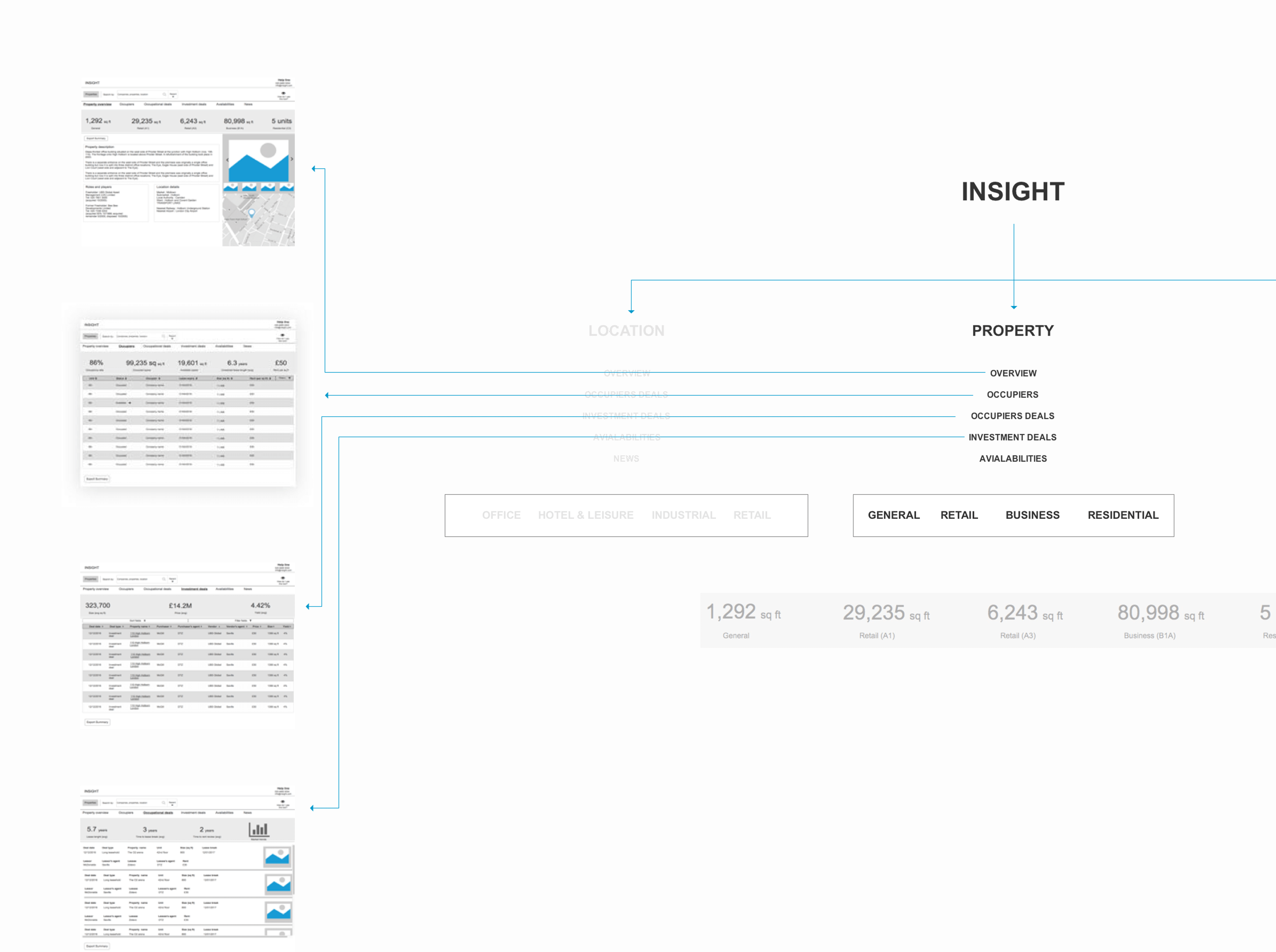
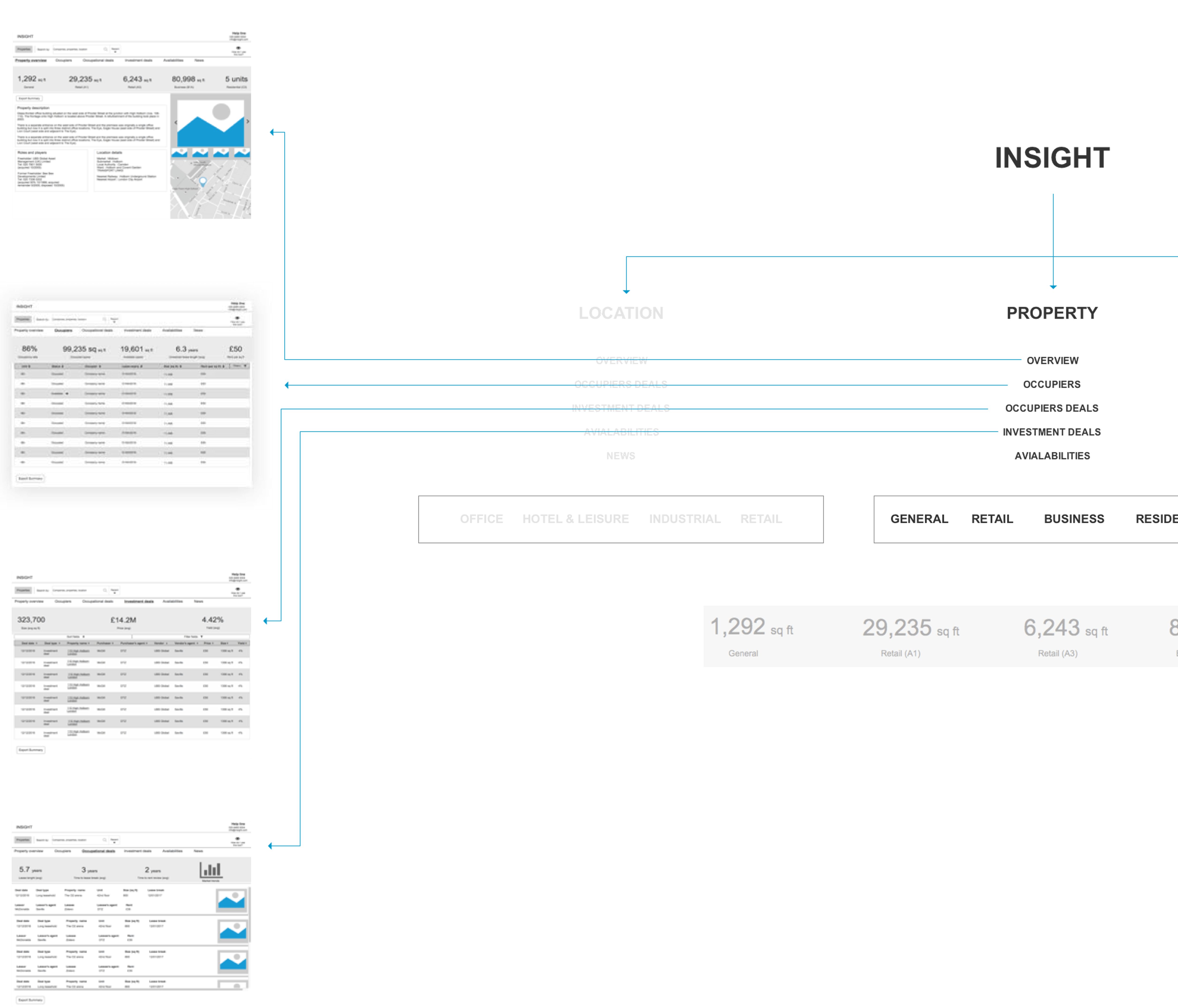
Being supplied with UX research results I focused on plaftorm usage decisions. In conclusion, I found two main advantages - its complexity and accessibility on mobile devices
VISUAL LANGUAGE
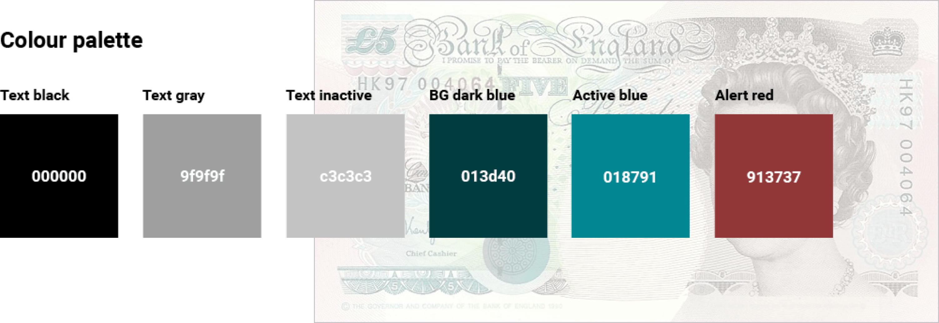
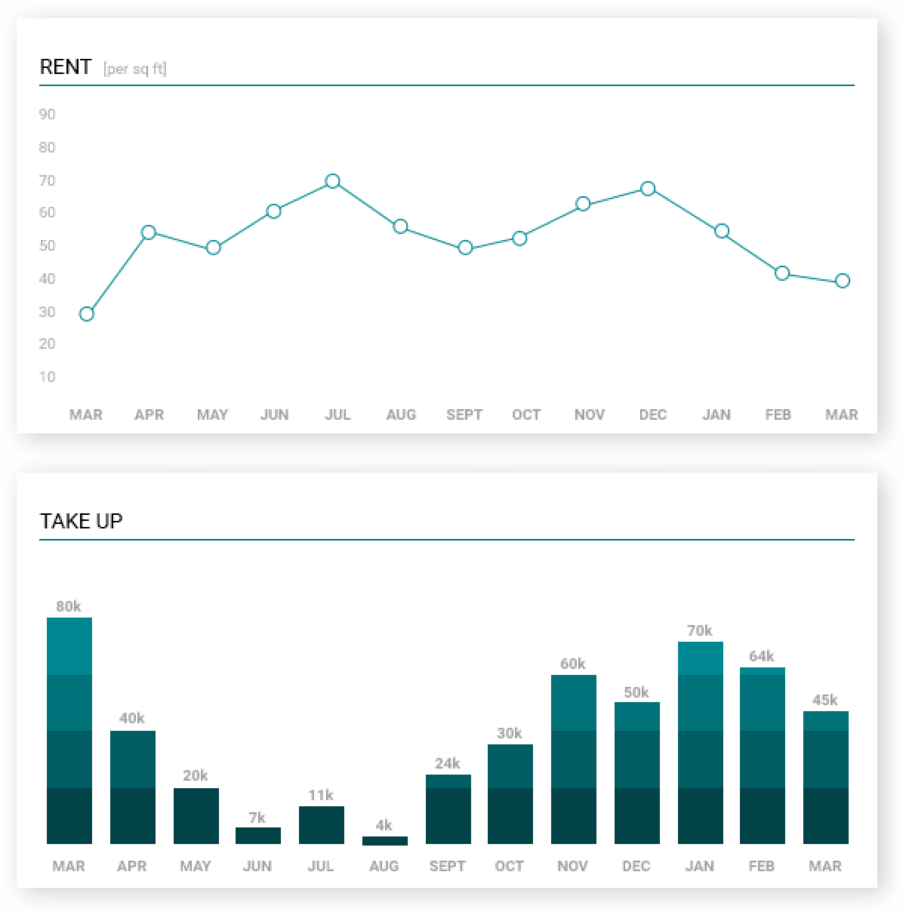
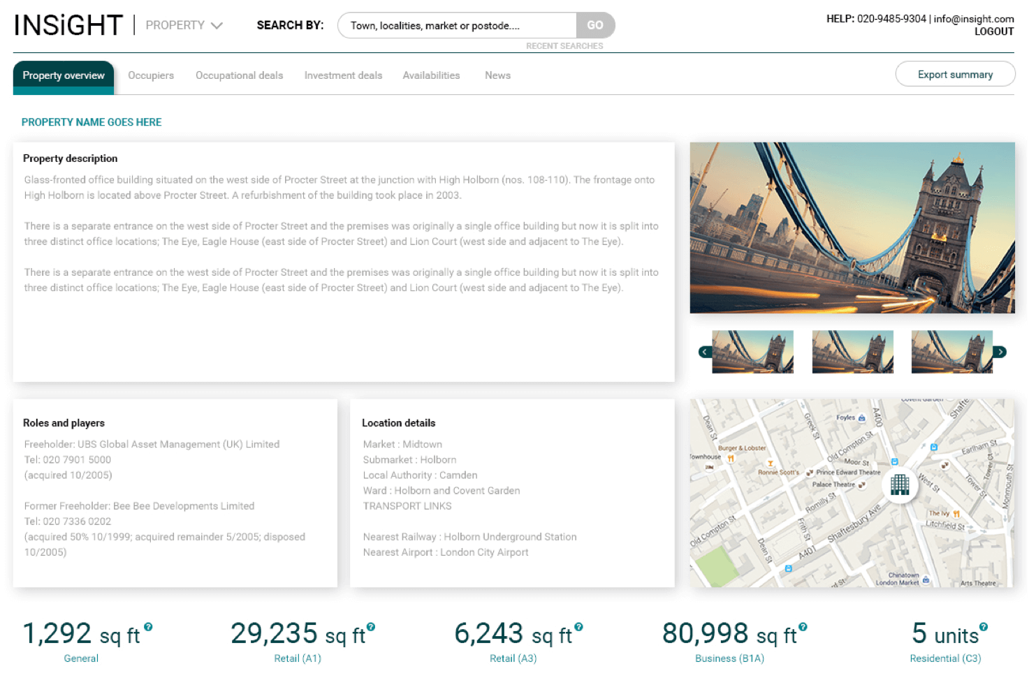
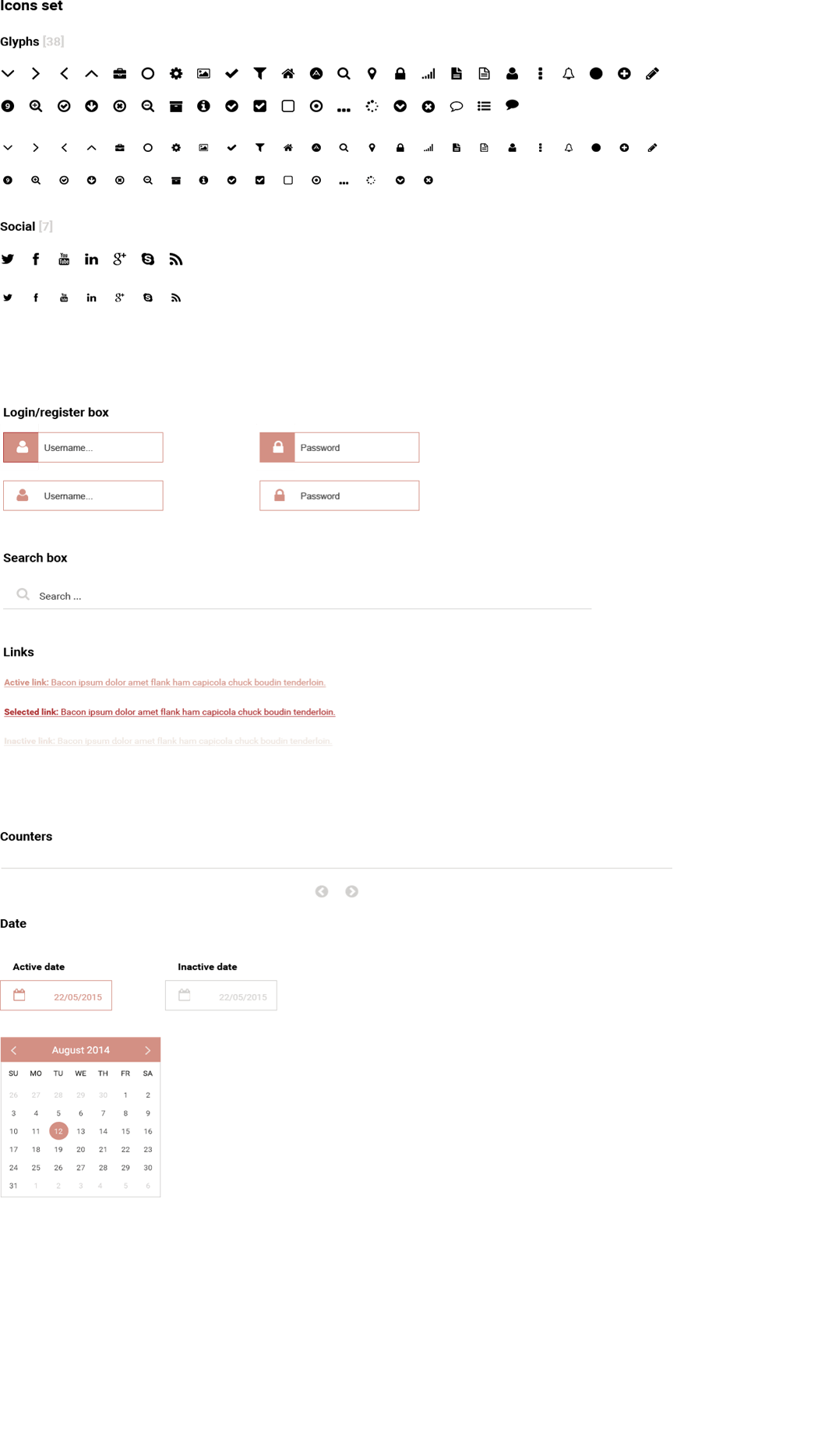
Visual language was based on distinct colour palette inspired by £5 note combined with Robot family font (considering many print documents attached to each property) and default system icon set to represent the most universal communication
VISUAL LANGUAGE
Visual language was based on distinct colour palette inspired by £5 note combined with Robot family font (considering many print documents attached to each property) and default system icon set to represent the most universal communication


UI DESIGN
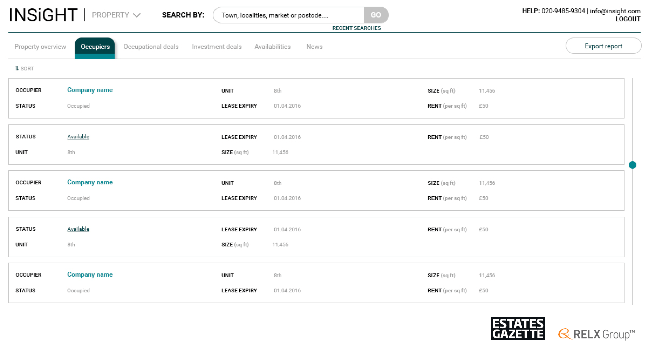
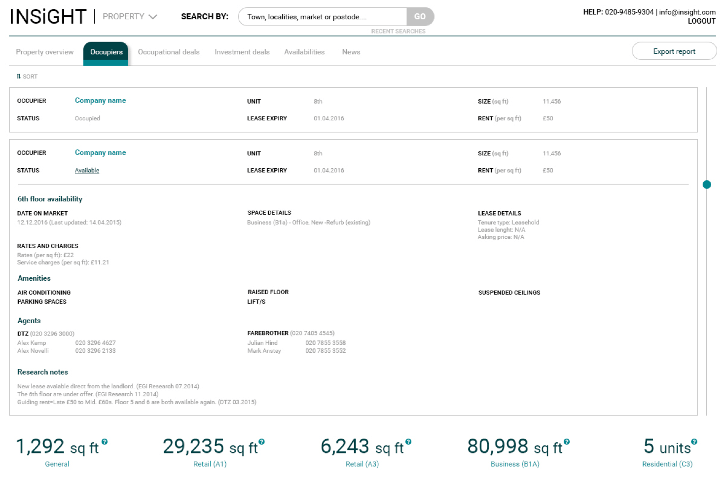
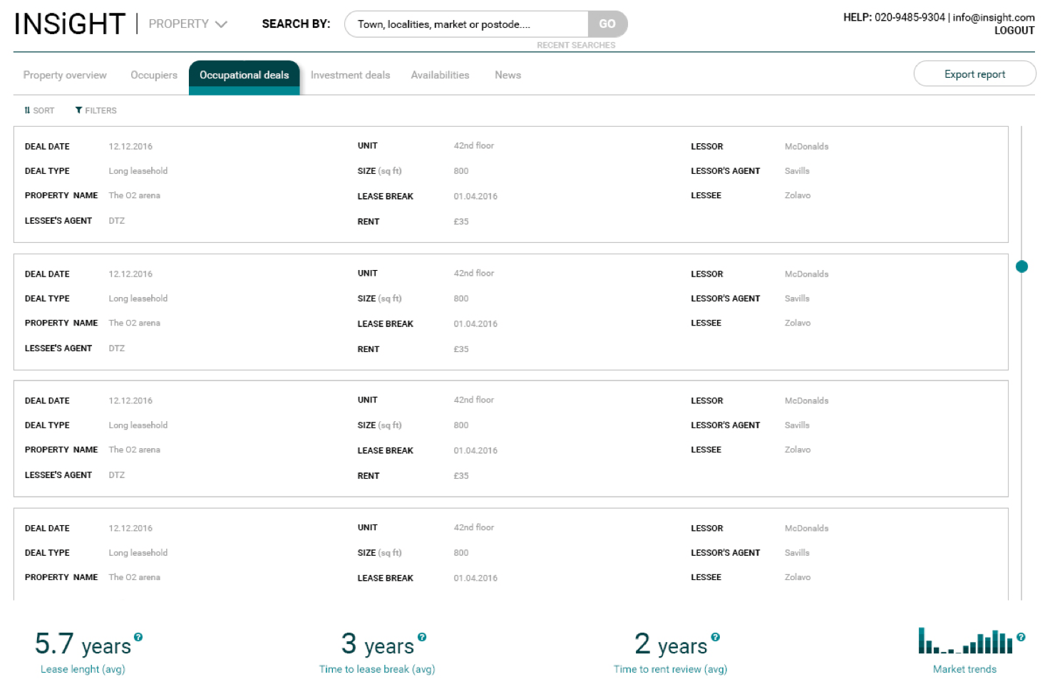
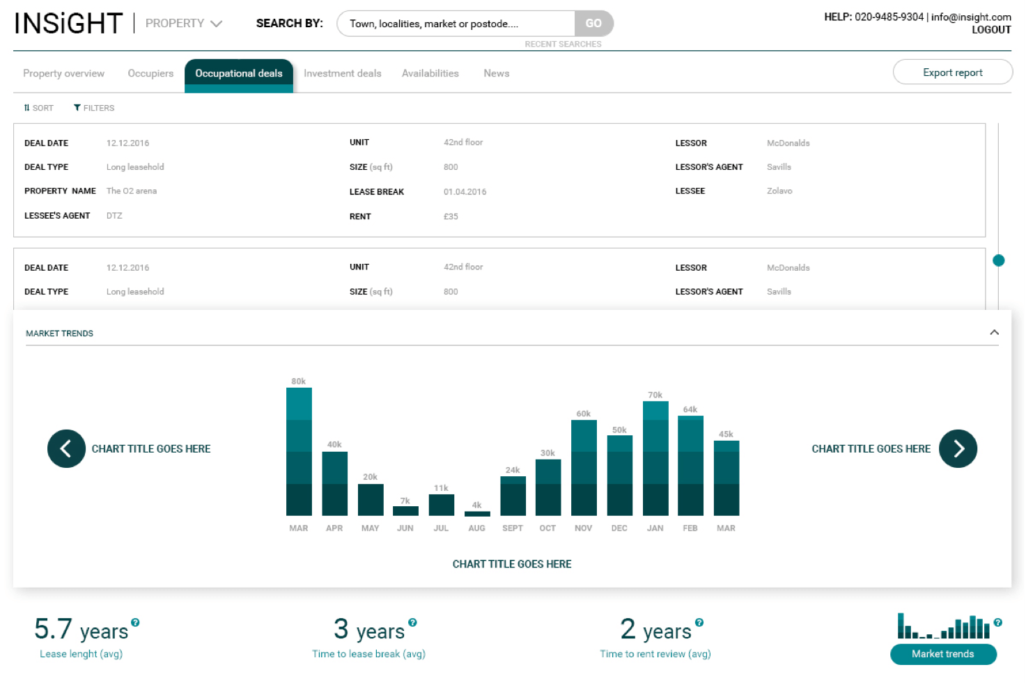
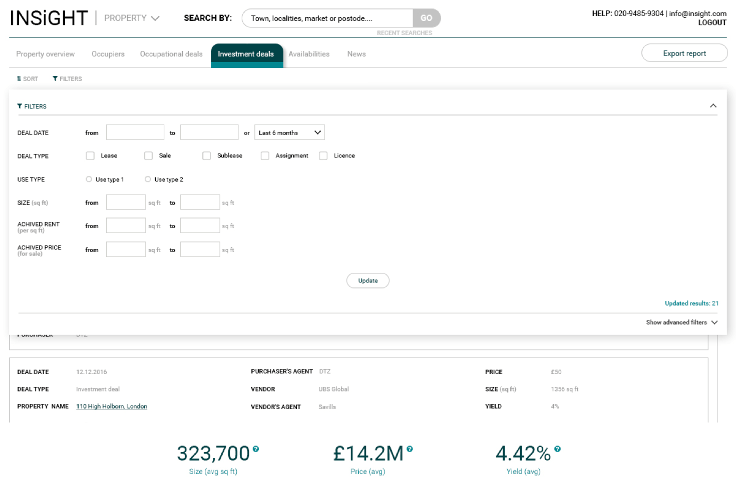
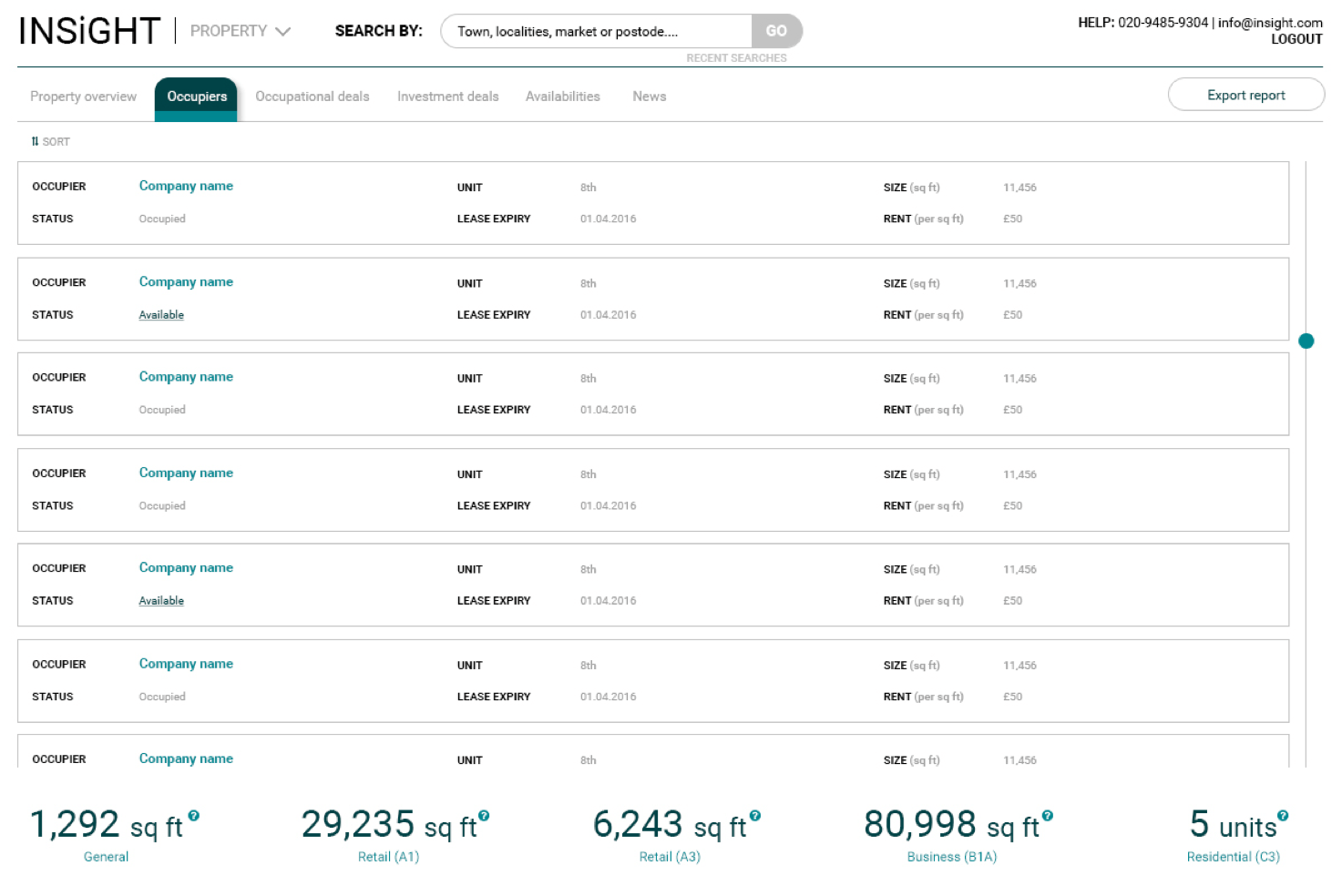
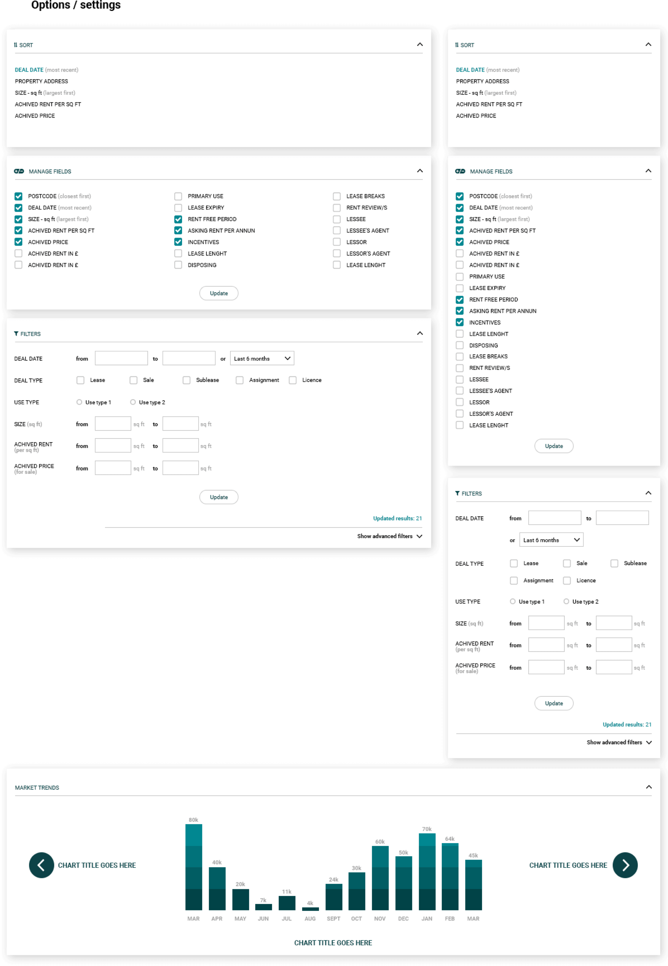
On boarding process was based on progressive reveal. To avoid cluttering layout key informations of each property were displayed as a default option. User was able to easily redefine filters and set up preview based on preferred custom features if necessary. Constant increase of property details information (which company plans to deploy in future) was resolved in modular design techniques and cards system usage
GUI TOOLKIT
DEVELOPMENT
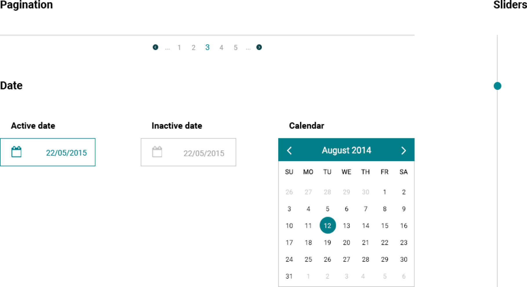
To maintain consistency, I provided a set of GUI tools with complex design solutions for future development
GUI TOOLKIT
DEVELOPMENT
To maintain consistency, I provided a set of GUI tools with complex design solutions for future development

RESPONSIVE
DASHBOARDS
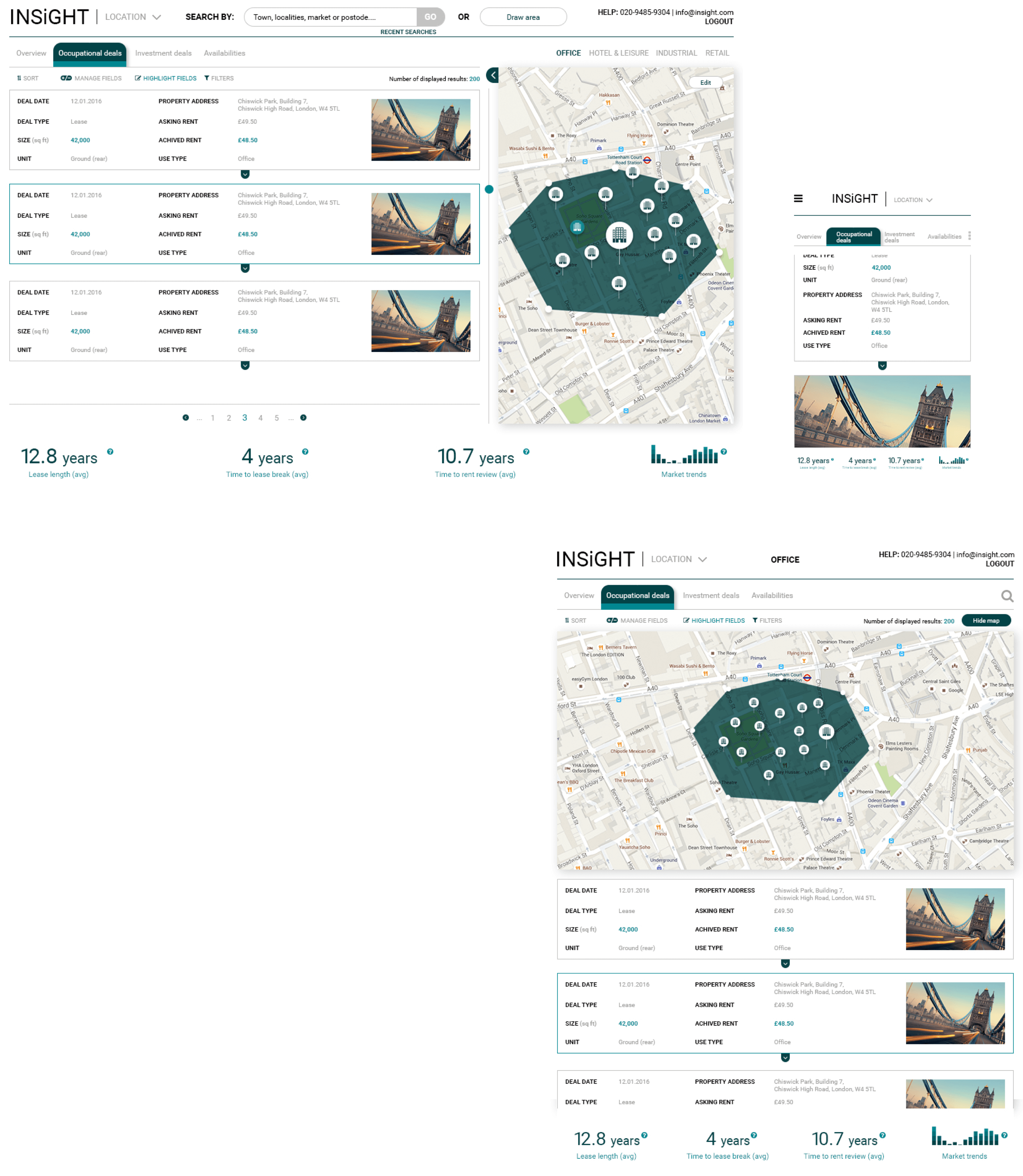
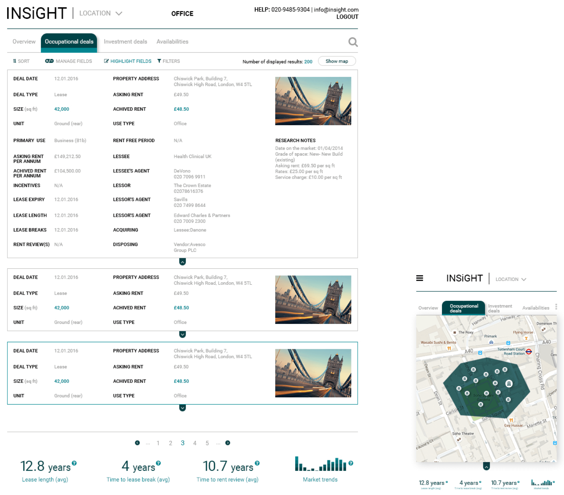
To maintain fluid user experience across each platform I based design creation on responsive design principles
FOLLOW UP
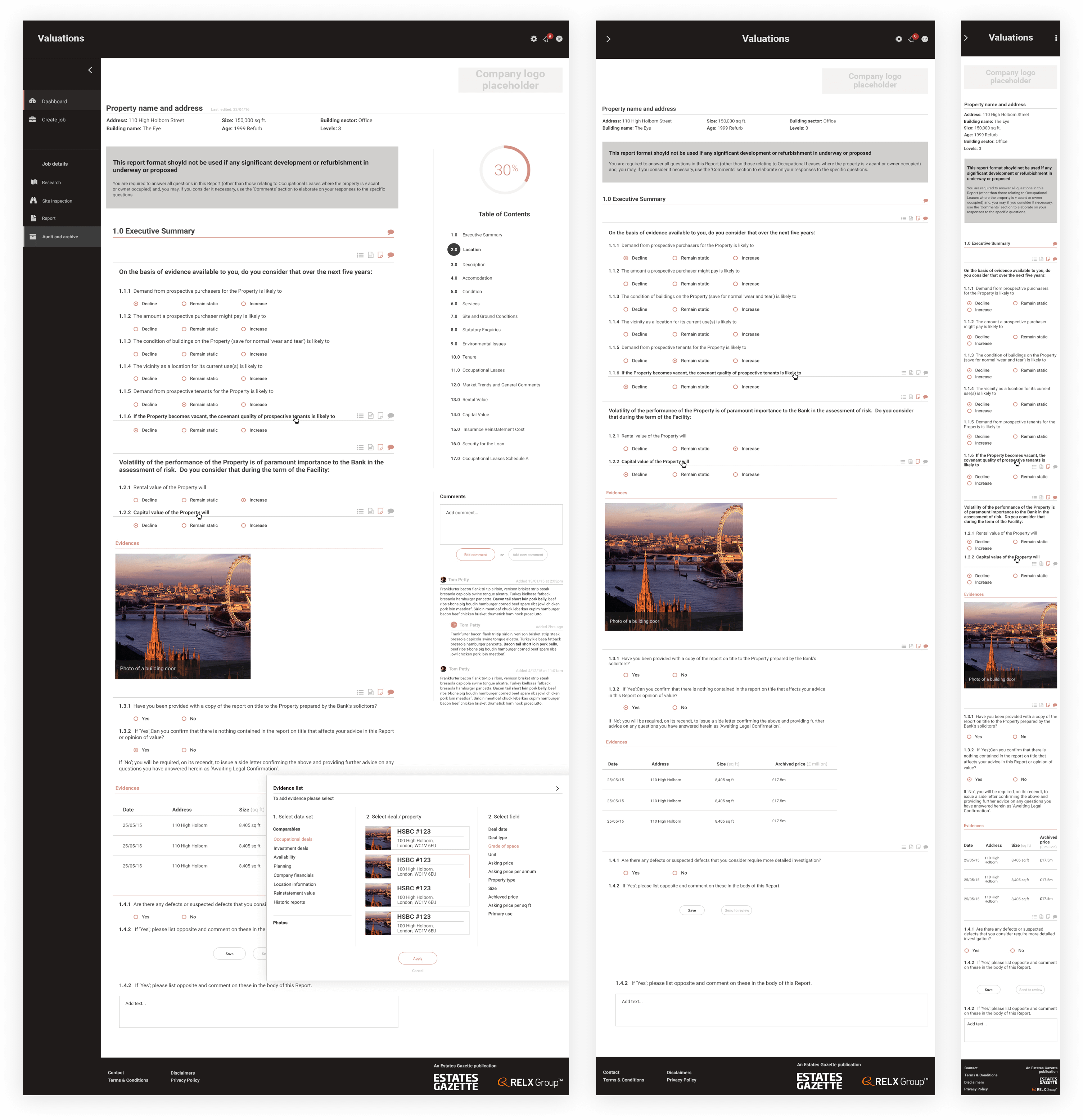
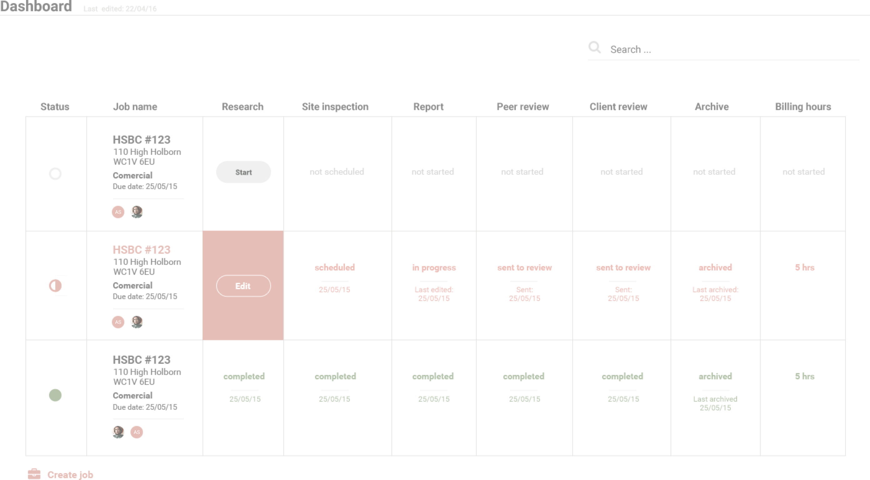
With successful results of the project RBI invited me to work with them on their next responsive dashboard - Valuation web app

FOLLOW UP
With successful results of the project RBI invited me to work with them on their next responsive dashboard - Valuation web app

